I don’t know about you guys, but this project has been a difficult one. I’m still trying to get the layout of my typography assignment functioning appropriately- so rather than posting a link to a finished project, I figured I’d give you a sense of how I’ve spent my time on this.
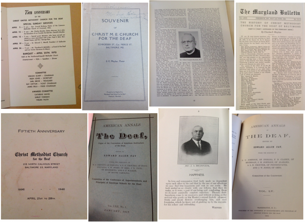
First I turned to my source material for information. As you can tell by the VERY high quality photos below, the majority of this material was collected during a research visit to church archives in Baltimore. I hoped to use these images as both typographical and compositional inspiration.

Here I collected fonts from a number of church materials- letterheads, program books, and church registers- as well as items from the Deaf press that would be representative of this period.

I also looked at the layout and composition of these documents, collecting eight that were visually interesting.

I also began collecting some details that appeared across the texts – I’m hoping to be able to integrate these details in the final project.
Armed with some visual inspiration, I also set about developing a mock-up of the final design.
You can see a rough version of it above and a link to my page here. The challenge for the past two days has been translating all the ideas into Dreamweaver. I hope you are all having great luck with this!
This week I commented on Sara’s Blog.

Jannelle,
I think it looks like a solid start. The hardest part is always translating your ideas into the code. You’ve got some really interesting material that I think will make for a great design. The layout seems like it will capture the readers eye and allow it to move from the top, down the right side, and then back up the left like Dr. Petrik had talked about. I’m wondering about the green box that you have offset from (what I am assuming is) the text. Is that going to be a pull quote? I also really like the two lines below the header as a way to style the subheads and replicate what you see in the source documents (again I’m guessing from the images those are for a subhead?)
Looking forward to seeing the final product!
Amanda
Thanks Amanda! It was definitely rough, but I think I’m at a good place and looking forward to the feedback we get tomorrow at critiques. I’ve been staring at this for too long and I’m curious what others think.
You are right: the goal of the greenbox was to be additional content: images or pull quotes. I wasn’t able to get it to line up the way I wanted to, but it’s pretty close to what I was going for. I’m on the hunt now for other little details I can use on the other pages.
Jannelle,
I like your inspiration for the typography- it’s great that you have actual documents that you want to emulate on your page. The layout and color scheme are great- I really like the green box in the foreground of the two red boxes. I can’t wait to see it finished!
Thanks Sara- I’m definitely lucky to have some content on hand from some archival research I did. I’ve only gotten permission from one archive, however, to use content online – so much more of the work is locked up in my computer files.
I wasn’t able to get the layout exactly how I wanted.. I was hoping for the green box to break the line of the vertical block text- keeping images and block quotes slightly justified to the right. I’ll keep at it… Thanks for the support!
Um, is it bad that this blog post looks better than my type assignment?
HA- I can’t take credit for anything here.. wordpress themes will beat my coding abilities across the board and I took screenshots of blurry photos.
I really, really like your layout, Jannelle. It’s visually appealing, and is solidly based on the source material. I kind of feel like you’ve set a benchmark for many of us; I would love it if my Final project was up the level you’ve already established here.
First of all, Beth I just laughed out loud!! I needed that this morning- thanks!
Second of all, I love the header Jannelle- the title font if perfect!
Also I am so jealous that you have copies of all these sources- I won’t have any of mine until after Spring Break so I am winging it until then.
Overall though I think it looks amazing! It makes me feel so inadequate haha! Looking forward to seeing what else you come up with!
Becca-
Thanks! Google fonts really came through for me! I spent a lot of time scrolling through their fonts to find something that worked with the time period. And don’t worry about the content – I will have to get back up to Baltimore with a scanner to continue with the project. Spring break will likely be spent in the basement rooms of a church. I can’t wait to see what else you do with your site!